
The Importance of Colour In Contemporary Architecture
Colour is a universal visual language that, when used thoughtfully in the world of design and architecture, can truly transform the essence of your building project. Not simply a tool for creating aesthetic interest, colour can evoke emotions, convey a sense of identity, emphasize features, and create depth and dimension through the use of shade.
The colour choices we make within our homes can also trigger psychological and emotional responses; able to influence our mood, behaviour—even our sense of well-being. As such, whether it’s a new build or a renovation, it’s always important to consider the role of colour in your architectural plans to ensure that it aligns with the intended purpose and desired effect of your space
So, let’s explore the wide and varied spectrum of colour and its importance in contemporary architecture, its many applications, and how it can enhance the overall design and functionality of your building project.

Colour: a universal visual language
Just as the colours of a painting can activate emotional responses in the observer, so too can the different tones used in a building or room profoundly influence how the user feels. Indeed, physiological studies have shown that certain colours can have transformative effects on our cognitive processes, so it’s no surprise that the aesthetic choices we make for our living spaces can make such a lasting impression.
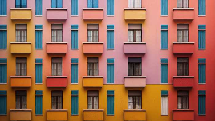
Architects use orange, for instance, to create vibrant and welcoming spaces. Less intense than red, rooms and exterior walls painted orange offer a natural brightness; a colour much less risky to use in abundance. Meanwhile, blue can promote a sense of cooling, serenity, and security, which, when used in structural features and ceilings can also add visual interest and create a sense of space, particularly lighter shades. Blue light installations are also among the most popular choices to use in outdoor spaces.
Influence of colour in architecture
In the UK, the use of colours in buildings has evolved over the centuries. There was a time when cities and towns were culturally dependent on the local raw materials available– from the city of Bath with its sun-catching limestone to ‘The Granite City’ of Aberdeen in Scotland—and a building’s colour and visual qualities were often determined by these factors.
The modern architect now has a much wider range of options available to them. With advances in technology and an increased focus on sustainability and environmental considerations, the use of colour in contemporary architecture has become even more nuanced, allowing for greater creativity and expression while still maintaining a strong connection to the natural world.
Indeed, colour is an expressive component in architecture and interior design, and a building’s character can be highlighted by its use. The colours of buildings influence our perception of the structure— particularly in residential and commercial buildings.
Visual ergonomics in architecture
Visual ergonomics is an essential component of any building project—one which focuses on the comfort, efficiency, and functionality of the visual features within a structure. When it comes to colour, visual ergonomics helps us understand the importance of colour in relation to the human eye and our ability to perceive certain shades and tones.
A well-designed space that takes into account the visual experience of the user will not only be aesthetically appealing but also enhance productivity, well-being, and the overall experience of those who inhabit it. So, when it comes to choosing a colour scheme for your project: think carefully, seek expert design advice, and build a space that works for you.
Expert colour scheme advice
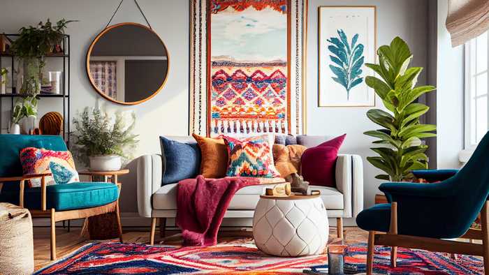
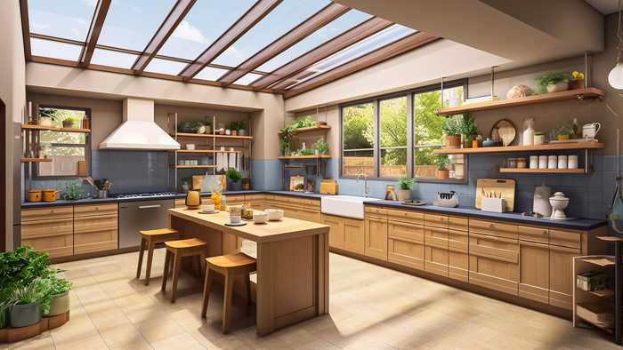
Your first job when planning a colour scheme for a new building project, is to think about the atmosphere you want to project with the design of each room—and choose colours that correspond with that mood. If you want to create a feeling of serenity and calm in a bathroom, for instance, combine soft blues, greens, and aquamarines. Meanwhile, for a vibrant and energetic kitchen space, opt for deep mustard yellows and burnt orange.
Do your research! Create mood boards with images, swatches, and samples of colours that evoke the emotions and style you want to convey in your design. Look for colour trends, consider the purpose of the space, and, importantly, think about how different colours can affect the mood and functionality of the area.
While it's no bad idea to have unique colour themes in each room, it's important to maintain a sense of continuity throughout the space. Choose tones that harmonise effortlessly from one room to the next. Now, that doesn't mean to say that every room has to have the same colour palette, but there should be a sense of tonal connectivity running through your home.
Impact colours and patterns can add vibrancy and interest to a space—but, unless used sparingly, they can clash and create visual chaos. Instead, offset bold colours and patterns with neutral buffers to create balance and harmony.
How can we help?
If you need help formulating a colour scheme for your building project, Maidenhead Planning is here to help. We’re always on hand to discuss ideas and use our knowledge and industry expertise to find the right solution for your build. So, why not get in touch with us today?
Posted by Wouter De Jager on April 6th 2023